
GreenMo
A category new enough that most buyers didn't know what questions to ask, let alone where to get the answers.
Adoption was growing. The buying experience hadn't caught up.
Electric vehicle adoption in India was growing but the buying experience hadn't caught up. Buyers researched across multiple platforms, relied heavily on word-of-mouth and had no single trusted source that combined vehicle discovery, credible comparisons, test drive booking and financing. The category was new enough that most buyers didn't know what questions to ask.
For buyers, comparing options objectively was near impossible with specs, range and total cost of ownership scattered across brand sites; awareness of the category was low and trust in EV-specific information lower still; and nothing addressed the whole journey from awareness through to purchase. The business had a harder version of the same problem - entering a category with no established competitor meant building trust from scratch, and an EV purchase needs range, charging and running costs explained before anyone will commit, for several buyer types at once who each hesitate about something different.
The challenge was to make a category people barely understood feel premium rather than remedial - building confidence inside the same flow as browsing and buying, without the whole thing turning into a course.
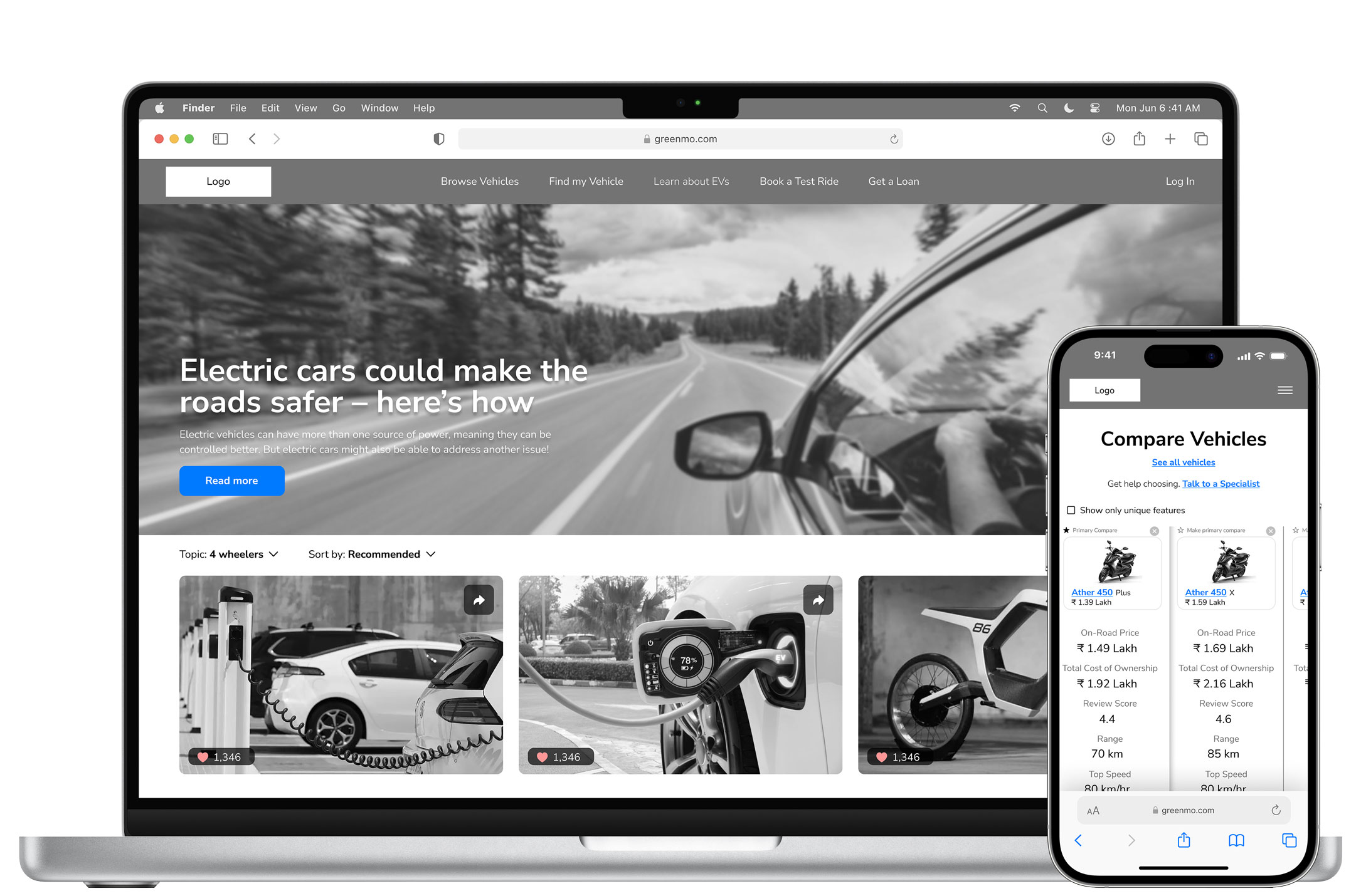
Desktop and mobile. Comparison puts on-road price, total cost of ownership, review score and real range side by side - the four things nobody could find in one place.
Buyers weren't reluctant to buy electric - they were reluctant to make a decision they couldn't fully understand. The real barrier was transparency, not intent.
They arrived with intent and left without confidence.
Stakeholder interviews and workshops using Value Proposition Canvas and Business Model Canvas surfaced the breadth of the business requirements. Empathy maps built for four distinct buyer types confirmed that the path to an EV purchase was primarily a confidence and trust problem, not a product discovery one. The buyer journey map identified the Discovery stage as the highest-risk drop-off point. Buyers arrived with intent but left without confidence. That single finding shaped every subsequent structural and design decision.
The four types had almost nothing in common - young achievers, families, teenagers and elderly users, and urban commuters - and their motivations, hesitations and information needs diverged enough that one undifferentiated flow would have served none of them. Their pain points clustered in the same places even so: range uncertainty, charging infrastructure, total cost of ownership, and the absence of a trusted voice at the moment of doubt.
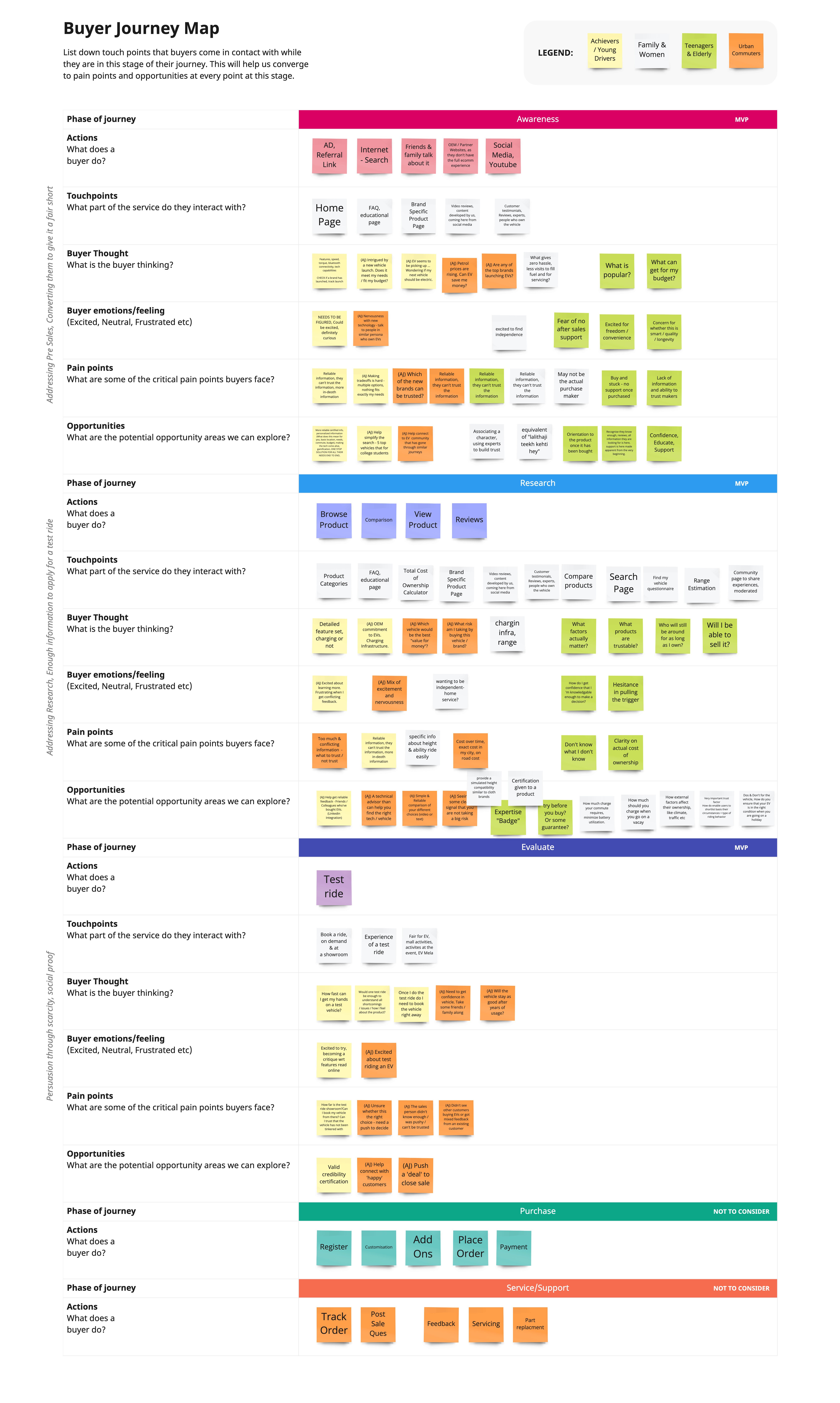
Empathy maps, colour-coded by buyer type. The same four anxieties recur across all of them: range, charging, resale, and who to believe.
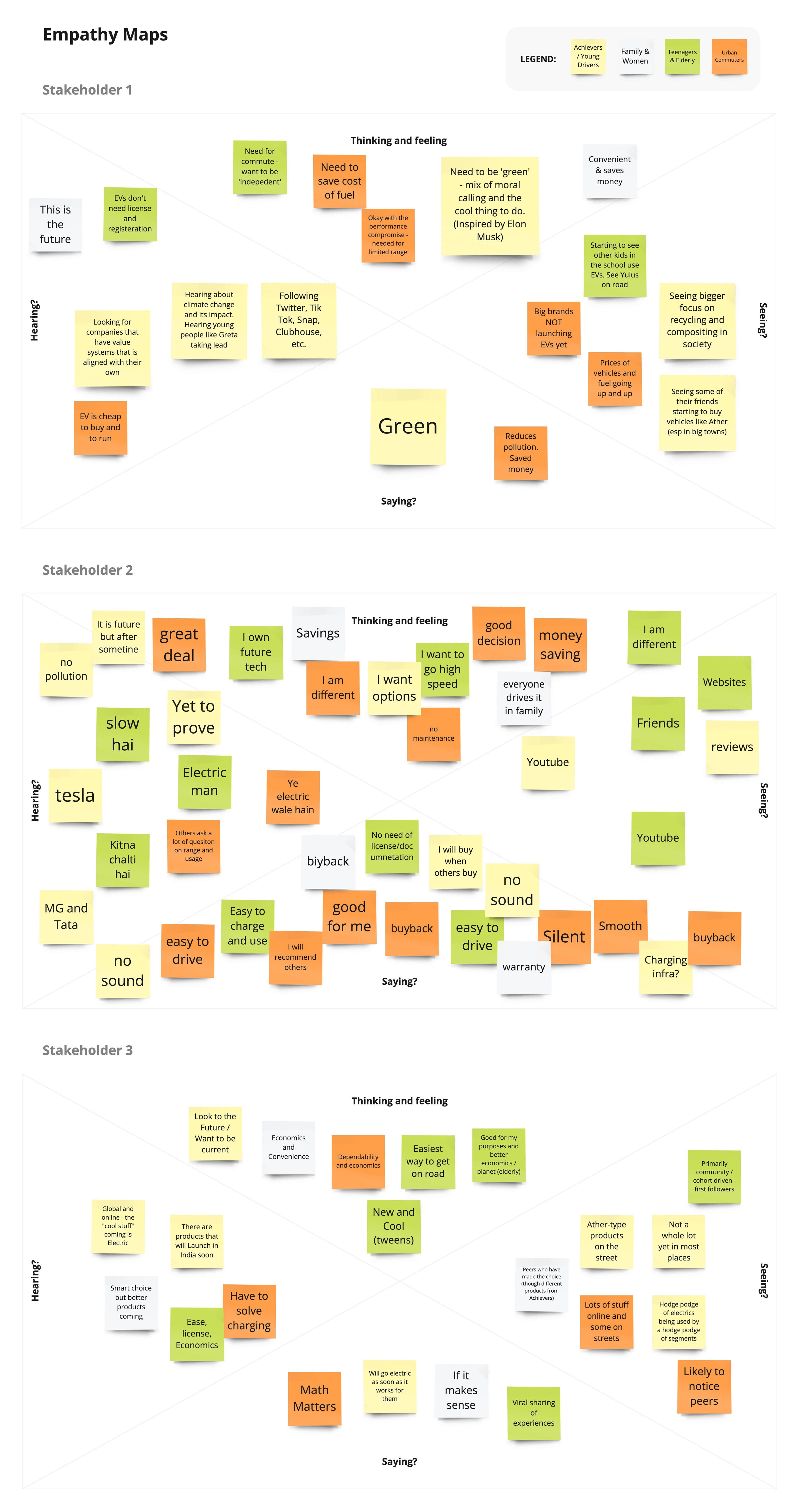
The journey map, phase by phase. Research carries by far the most pain points - which is why it, not purchase, became the thing to design.
Structure first, and a front door for people who don't know what they want.
Post-discovery, a detailed information architecture was built across two levels of navigation before any wireframes began - covering Browse Vehicles, Find My Vehicle, Learn About EVs, Book a Test Ride and authentication flows. The decision to surface Find My Vehicle as a top-level navigation item rather than a filter inside Browse was deliberate: research showed a significant portion of buyers didn't know which vehicle they wanted. Leading with a guided recommendation flow addressed buyer uncertainty at the entry point rather than leaving them to self-select their way through.
Trust was built through the experience rather than around it. Instead of a separate educational section, expert content - blogs, reviews, range calculators, cost breakdowns - was embedded directly into product pages and comparison flows, so it arrived at the moment of hesitation rather than waiting somewhere a hesitant buyer would never go.
Three calls shaped the rest: comparison as a core interaction rather than a feature, backed by research showing buyers were already deciding across multiple sources; one unified journey rather than separate features, since fragmenting research, comparison and test drive booking would have rebuilt the exact problem people came with; and mobile-first throughout, matching the observed behaviour.
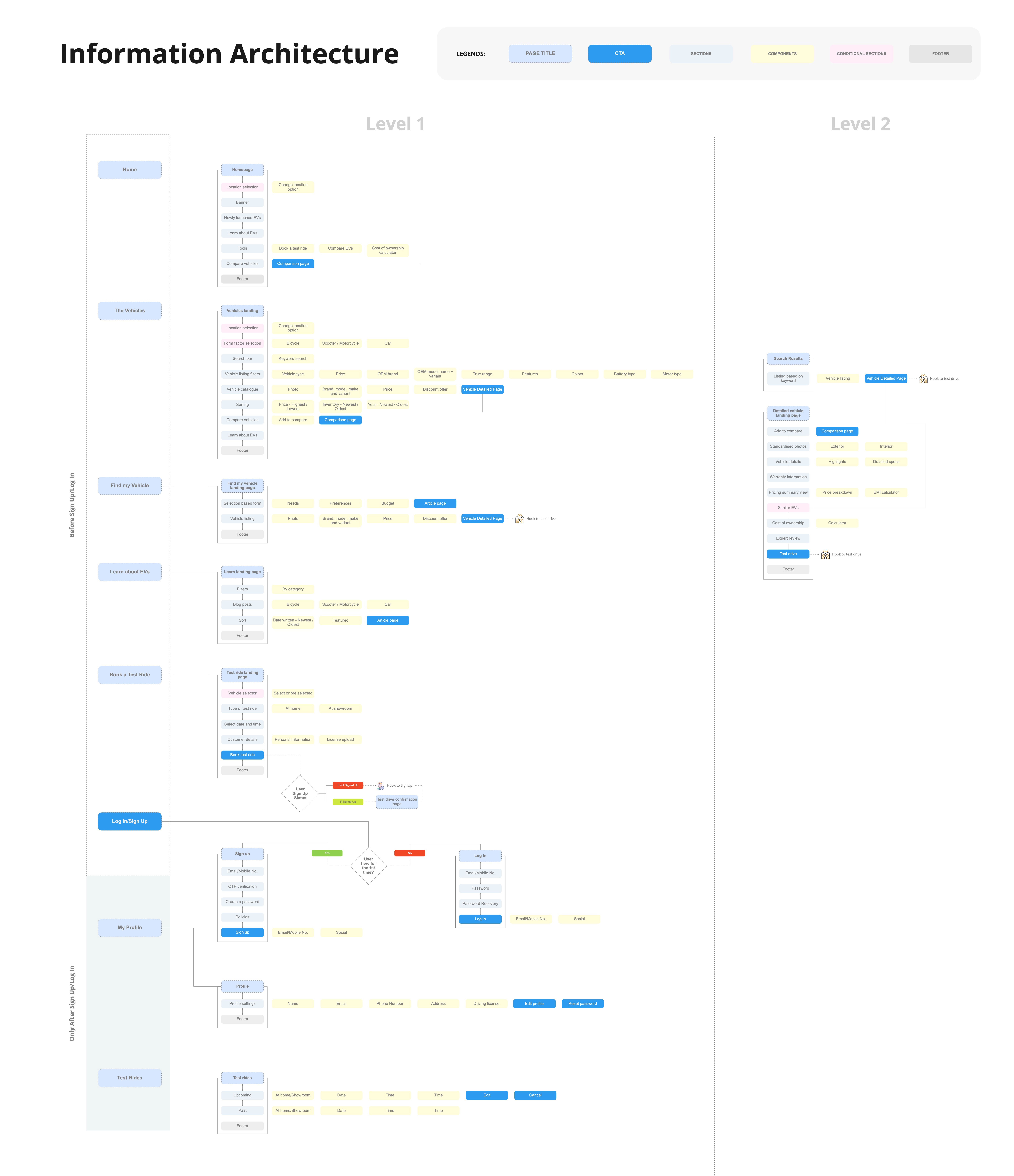
Two levels, mapped before any wireframe. Find my Vehicle sits at the top level beside Browse, not inside it.
Three flows carried it, and none of them felt like homework.
The experience was built mobile-first across all key flows. Three journeys anchored the visual design work: the vehicle detail page, which needed to carry pricing calculators, cost of ownership, reviews and specs without feeling dense; the comparison flow, which needed to make spec differences scannable on small screens; and the Find My Vehicle personalisation flow, which had to feel guided without feeling like a questionnaire.
Four things carried the platform. Personalised discovery narrows the field early through preference-based entry points, cutting decision fatigue before it starts. Side-by-side comparison lets someone evaluate vehicles across specs, pricing and features in one structured, transparent view. The purchase journey connects research to action - test drive scheduling, loan applications and dealer contact all sit inside the same flow. And the content layer is placed contextually rather than parked in a blog, appearing on the pages where doubt actually shows up.
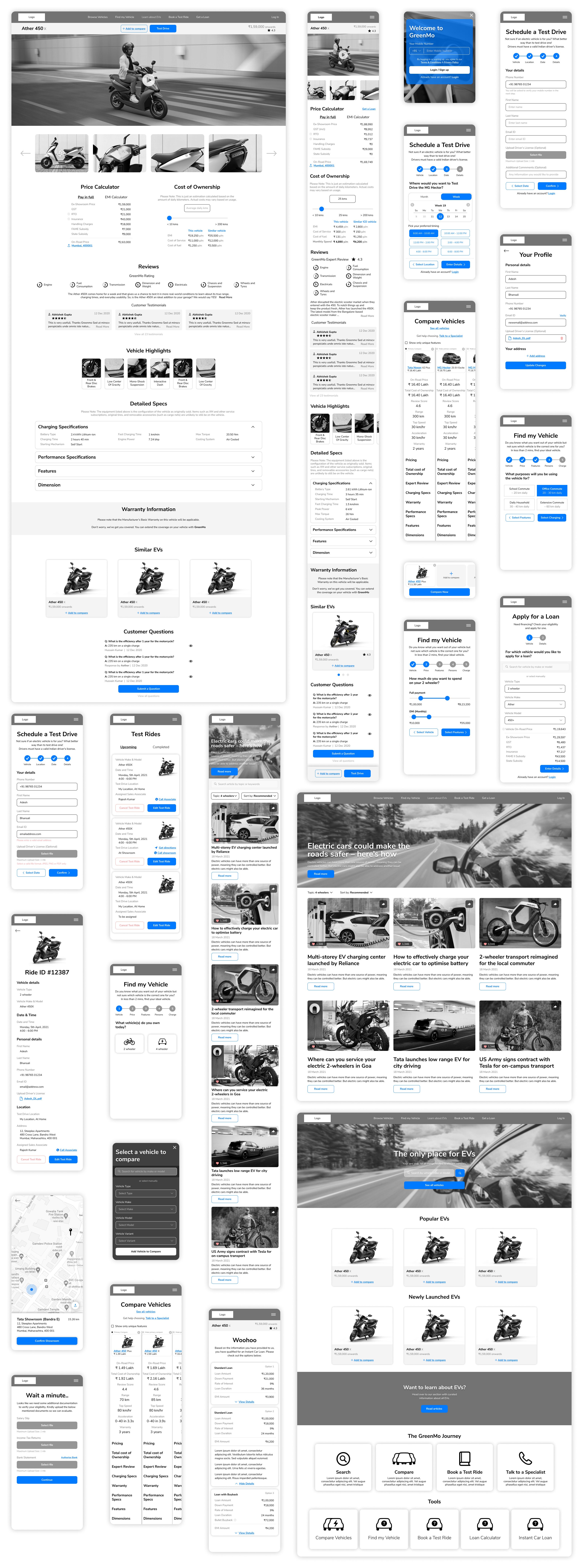
The vehicle page carries the price calculator, cost of ownership, reviews and specs without becoming a spec sheet. Test ride and loan sit in the same flow.
One place to research, compare and buy - the first in India.
The fragmented research-to-purchase process collapsed into one continuous flow, so buyers no longer had to leave the platform to compare options. Comparison and filtering gave first-time buyers a way to narrow the field themselves rather than depending on dealer guidance, and GreenMo was positioned early in India's EV adoption curve as a single place to research, compare and buy.
The structured journey, combined with comparison tools and integrated actions, helped users move more confidently from exploration to decision, reducing reliance on external sources. The impact came from one structural decision more than any visual one: treating the research phase as the primary design surface and embedding comparison and expert content directly into the product flow rather than separating them out.
In a new category the IA is the design work.
GreenMo was the first project where I designed for a category most users were simultaneously curious about and uncertain of - which meant the experience had to educate and convert within the same flow. In hindsight, the Find My Vehicle flow deserved more prominence from the very first screen. The larger learning was that in a new category, the most impactful design work isn't the UI - it's the IA. Getting the structure right before touching visual design was what allowed the experience to feel clear rather than overwhelming.