
PS Group
A personalised web platform for discovering and exploring real estate projects across India
PS Group is one of India's largest real estate developers with a strong pan-India presence and decades of experience. The website needed to showcase a diverse portfolio across residential and commercial projects. The goal was a conversational, user-driven experience that helped people quickly find projects that match their needs.
Outcomes
| Engagement | Replaced a static listing page with an interactive browsing experience, keeping visitors exploring projects for longer instead of bouncing on arrival |
| Discovery | Guided filtering let visitors narrow down to relevant projects directly, instead of scanning an undifferentiated list |
| Brand perception | Repositioned PS Group's online presence as premium and user-first, in line with the rest of the brand |
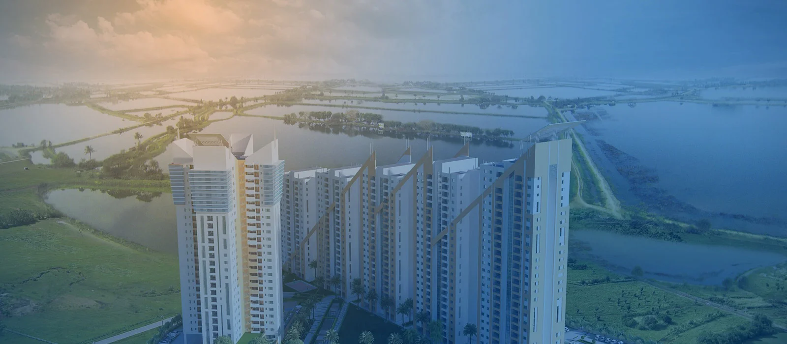
Real estate websites in India typically operate as property directories - long lists, dense filters and spec sheets that treat buyers as transactions. PS Group had the brand equity and portfolio scale to do something different, but their existing website wasn't reflecting that. Users arrived, didn't find what they needed quickly and left. The site wasn't earning the time of the people it needed to convert.
User problem
- Buyers couldn't quickly surface projects that matched their location, type and budget without navigating through an undifferentiated catalogue
- No mechanism existed to help users get a feel for a project before committing to an enquiry
- Comparing options across location, budget and lifestyle needs took too much effort
- The experience did not build enough trust to move from browsing to enquiry
System or business problem
- High bounce rate indicated the site was failing at its primary job: keeping prospective buyers engaged long enough to generate a lead
- Brand messaging was inconsistent - the “It is family time” concept lived in marketing collateral but not in the digital experience
- Requirement to support diverse user needs across budgets and locations
The problem wasn't the portfolio - it was that buyers had no way to see themselves living in it.
Designing a system that simplifies exploration without reducing the complexity of choices, while maintaining a consistent brand voice across the experience.
I owned end-to-end design on this project - from discovery sessions with the founders and core team through to final UI delivery. I ran the in-person alignment workshops, led user research, made the structural decisions on information architecture and delivered the full visual design including the design system. The development handoff and responsive behaviour specs were also part of my scope.
1.People weren't browsing - they were trying to decide
Most visitors arrived with a decision to make and not a desire to explore a brand. The experience needed to start with their criteria and progressively reveal options, rather than forcing them into generic navigation.
2.Confidence came from clarity, not more content
Users needed a structured way to understand a project quickly: what it is, where it sits, what you get and what matters most. The direction became reduce reading, increase comprehension - through hierarchy, modular sections and consistent patterns.
3.Brand needed to show up in micro-decisions
The site could not rely on visuals alone to feel premium. Brand had to live in details - tone, motion, spacing, typography and a calm but distinctive colour system that made the experience feel intentional at every step.
Research revealed that users were arriving on the site, failing to connect with what PS Group stood for, and leaving before exploring any individual project. Discovery sessions with the founders surfaced that the brand's identity - rooted in the idea of family and quality time together - had never been designed into the digital experience. User research reinforced that filtering options were the single most important functional need: buyers wanted to search by location and budget without wading through an undifferentiated list.
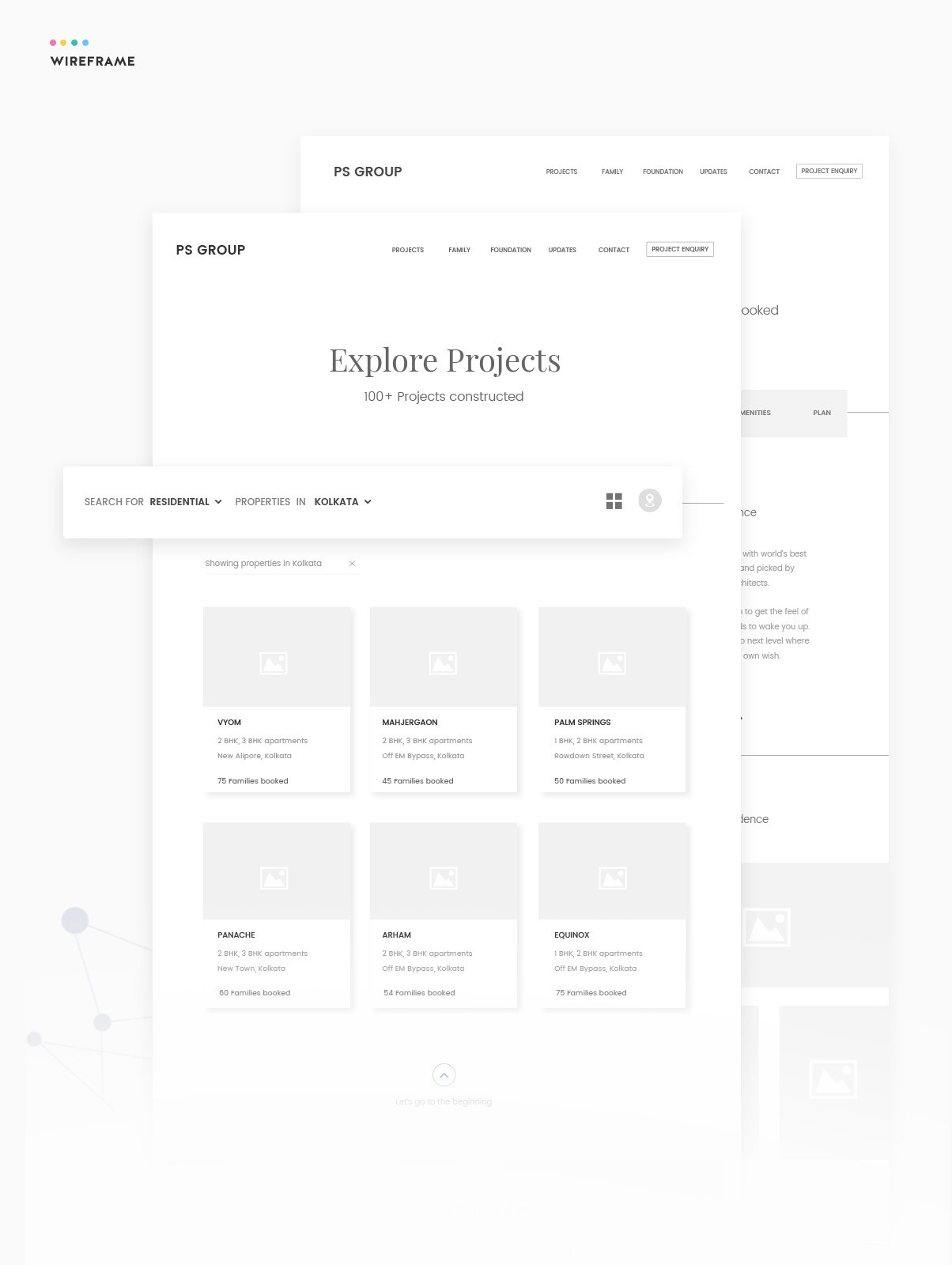
The central structural decision was to lead with visual project browsing rather than a search form - users would see projects first and filter from there, not gate the experience behind a form. Location and budget were established as the primary filter axes, with property type as a secondary layer. The “It is family time” concept was locked in as the guiding communication principle, which ruled out a purely functional, spec-driven layout in favour of one that led with imagery and human context.
We designed the platform to be highly interactive, using micro-interactions to make browsing feel responsive and guided. The browsing experience used image-heavy cards and a carousel pattern for project snippets so users could quickly scan, shortlist and go deeper. The UI system leaned on generous white space and a calm layout to keep attention on the projects, while using brand colour and typography to maintain a premium feel.
Conversational project discovery
Users are guided through project exploration using structured filters and contextual cues, helping them narrow down options based on their preferences.
Scannable project detail pages
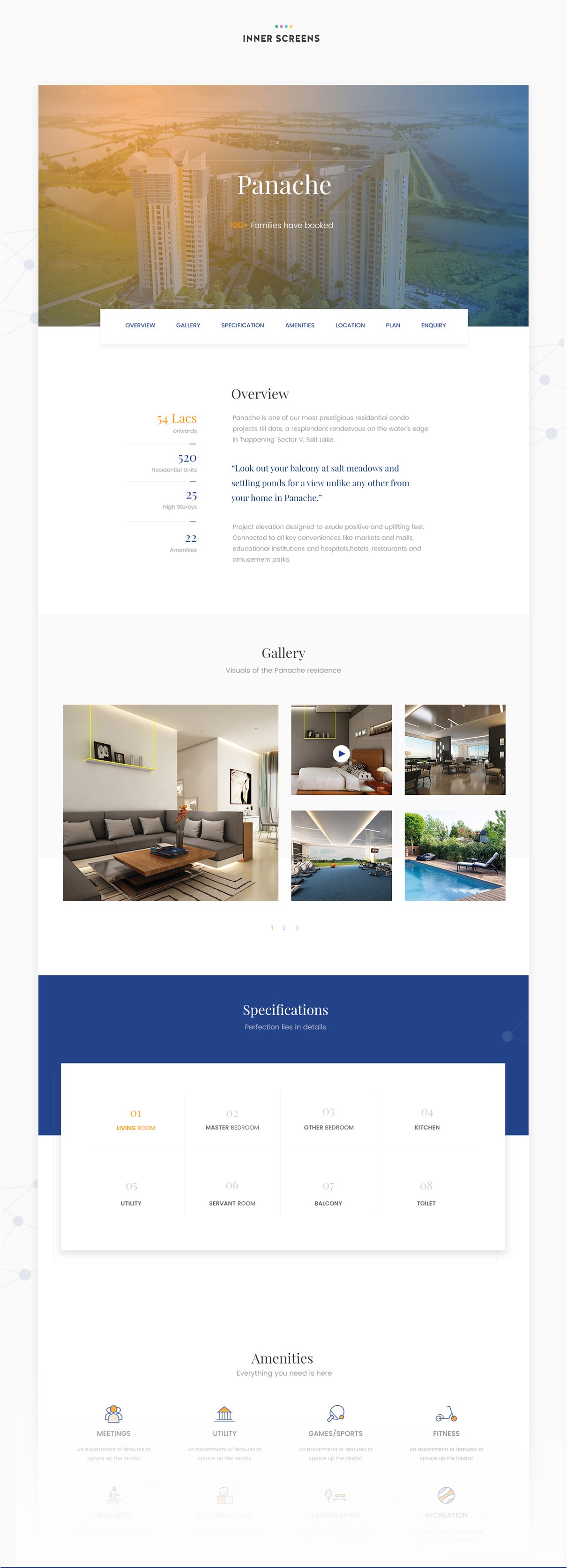
Each project page was structured into clear modules so users could understand a project quickly without hunting - reducing cognitive load across dozens of projects.
Amenities as a confidence builder
Amenities were designed to help users assess lifestyle fit quickly, turning marketing content into a decision aid that supported the premium positioning.
Responsive without losing hierarchy
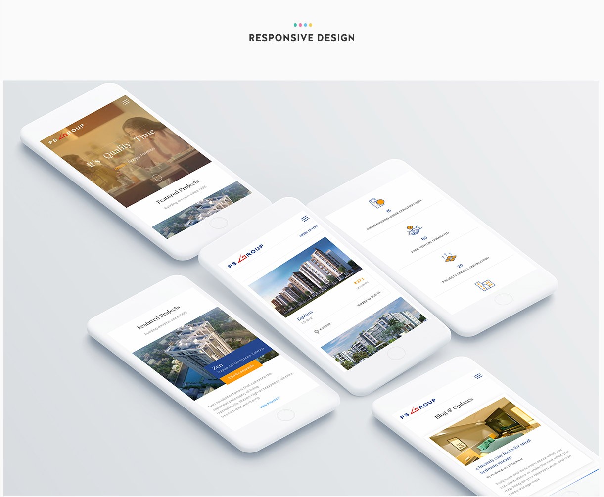
The browsing model and project hierarchy remained intact on mobile. Filters, cards and project modules were adapted to small screens without collapsing into long, unstructured pages.
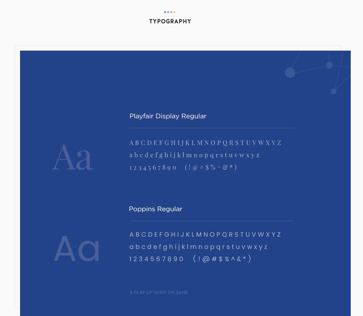
- Typography: Playfair Display for headings and display text; Poppins for body and UI copy - a serif/sans pairing that created a premium tone readable at all sizes
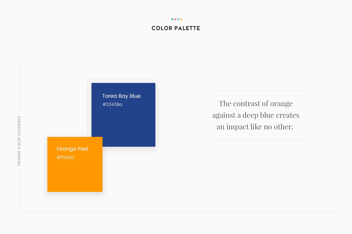
- Colour: Torea Bay Blue as primary, Orange Peel as accent - high contrast chosen to work against photography and white space equally
- Iconography: Custom line-style icons for the amenities section - consistent weight and style across a high volume of categories
- Reduced bounce rates through improved engagement
- Increased time spent on project exploration
- Improved clarity in navigating large project portfolios
- Strengthened brand consistency across the digital experience
The impact happened because the design solved two problems at once. It gave buyers a fast, low-friction path to relevant projects through the conversational filter system, and it gave PS Group a way to communicate brand identity that didn't depend on copy - the imagery, the stats, the pacing of information did that job instead.
Key decisions I drove
- Locked “It is family time” as the guiding concept, forming the foundation for all downstream design decisions
- Prioritised filtering as the primary interaction model over static navigation
- Designed a conversational experience instead of a traditional listing-based interface
- Focused on visual-first exploration to support faster decision-making
What I influenced
- Information architecture and navigation structure
- Alignment between brand communication and product experience
- The framing of enquiry as the last step in a journey, not a persistent CTA fighting for attention on every page
I initially approached the problem as a content organisation challenge, but realised that the real opportunity was in shaping how users discover projects, not just how information is presented. If revisited, I would explore deeper personalisation based on user intent to further improve relevance in early-stage discovery. This project reinforced that in complex decision-making environments like real estate, the experience is defined less by the availability of information and more by how effectively users are guided through it.